目录
工具栏(Tabbar)
功能说明
该控件用分页栏。
HTML5
<tabbar id="tabbar0" value="buttongroup"><tabbaritem id="tabbaritem0" tabbarItemType="icontext" text="我的关注" hecked="true"/><tabbaritem id="tabbaritem1" tabbarItemType="icontext" text="联系人"/></tabbar>
属性列表
| 属性名 | 属性值 | 说明 |
|---|---|---|
| tabbarItemType | text | 显示类型(text:只显示文本,文本居中;icon:只显示图标,图标居中;icontext:显示文本和图标,整体居中) |
| checked | false | 选中状态(false:默认值,不选中;true:selectedIndex等于当前的tabbarItem则为true表示该tabbarItem是否处于选中状态 |
| value | 该tabbarItem的数据值 | |
| bindfield | bindfield的值会绑定到checked属性上,反之checked属性的值会收集到bindfield上 | |
| pressed-color | 触屏幕时的背景色 | |
| icon-pressed-image | 触屏幕时的背景图片 | |
| icon-width | 图标宽 | |
| icon-height | 图标高 | |
| icon-text-spacing | 图标文字间距 | |
| selectedIndex | tabbar控件通过selectedIndex来控制该属性,selectedIndex等于当前的tabbarItem则为true,否则为false;当checked为true时,控件的css变为按下状态;当check==false时,tabbaritem的css加载默认状态(非checked状态)的样式,即background-color、background-image、icon-background-image、color生效;当check==true时,tabbaritem的css加载checked状态的样式,即pressed-color、pressed-image、icon-pressed-image、font-pressed-color生效 | |
| text-align | 文本在控件中的位置(left、right、top、button) |
支持公共属性
参见公共属性说明
事件列表
| 事件名 | 说明 |
|---|---|
| onchange | 参见公共事件 |
支持公共事件
参见公共事件说明
操作实例
1、使用工具栏之target来实现导航功能
<!--window1使用tabbar--><tabBar id="tabBar1" selectedIndex = "0"><tabBarItem id="tabBarItem0" text="通话记录" target="window1"></tabBarItem><tabBarItem id="tabBarItem1" text="主菜单" target="window2"></tabBarItem></tabBar><!--window2使用tabbar--><tabBar id="tabBar1" selectedIndex = "1"><tabBarItem id="tabBarItem0" text="通话记录" target="window1"></tabBarItem><tabBarItem id="tabBarItem1" text="主菜单" target="window2"></tabBarItem></tabBar>
2、通过操作工具栏来控制某个tabbarItem
$id("tabBar1").get("selectedIndex")$id("tabBar1").set("selectedIndex", 1);
3、直接操作tabbarItem的checked
$id("tabBarItem1").set("checked", "true");$id("tabBarItem1").get("selectedIndex");
4、直接操作tabbarItem的text
$id("tabBarItem1").set("text", "test1");$id("tabBarItem1").get("text");
场景示例
本文介绍工具栏的以下三种主题的使用情况。
- 场景一:工具栏如何只显示文字、如何只显示图标、如何显示文字+图标、如何更改文字和图标?
- 场景二:通过点击不同的tabbaritem来显示不同的页面;
- 场景三:工具栏结合多页容器使用;
场景1、工具栏如何只显示文字、如何只显示图标、如何显示文字+图标?
通过修改工具栏属性的显示类型,来决定tabbaritem显示情况
- 显示类型为文本时,tabbaritem只显示文字;
- 显示类型为图标时,tabbaritem只显示图标;
- 显示类型为图标+文本时,tabbaritem显示图标+文字;
如何更改文字和图标?
通过修改tabbaritem文本的值,来修改在tabbaritem上显示的文字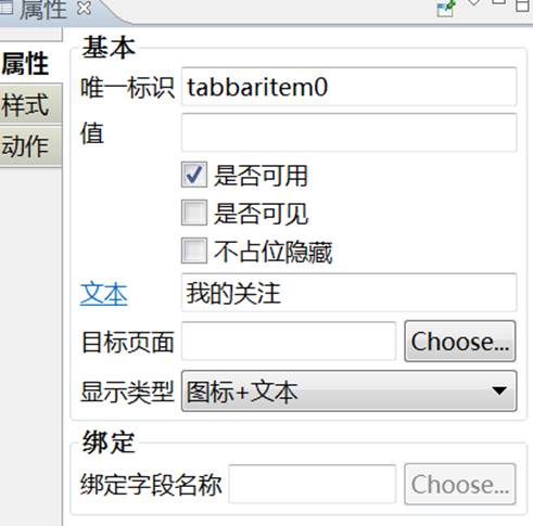
通过修改样式里的图标和图标按下背景图,来更改tabbaritem的显示图标
场景2、通过点击不同的tabbaritem来显示不同的页面
选到具体的tabbaritem上,配置属性里的目标页面即可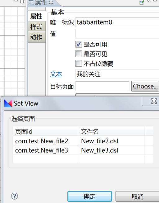
场景3、工具栏结合多页容器使用
功能说明:通过选择不同的tabbaritem来展示不同的多页容器页面视图
示例
<flipper id="flipperdefine0" onnextflipper="next()" onpreviousflipper="previous()" viewindex="0"><div id="panel0" title="页面1"><label id="label0">1</label></div><div id="panel1" title="页面2"><label id="label2">2</label></div></flipper><tabbar id="tabbar0" value="buttongroup"><tabbaritem id="tabbaritem0" tabbarItemType="icontext" text="我的关注" class="tabitemclass" onclick="myAttention()" checked="true"/><tabbaritem id="tabbaritem1" tabbarItemType="icontext" text="联系人" class="tabitemclass" onclick="Contactor()"/></tabbar>
//tabbaritem上设置onclick事件functionmyAttention(sender, args) {$id("flipperdefine0").set("viewindex", 0);}functionContactor(sender, args) {$id("flipperdefine0").set("viewindex", 1);}
文档更新时间: 2018-01-15 14:27